We Noticed
The Menu Is a User Interface
Luke September 30, 2026

The Menu Is a User Interface
A menu has one job. It has to let a stranger walk in, figure out what you sell, what it costs and whether they can eat it, and then order with confidence. That is a user interface, and a lot of restaurants would fail a usability test on it.
I do not mean the food. The food can be wonderful. I mean the thing you hand people before the food: the laminated card with 8-point type, the chalkboard in cursive, the menu that lists "market price" for half the dishes, or the little QR code taped to the table that opens a PDF you have to pinch and zoom on your phone.
Once you start looking at menus as interfaces, you cannot stop.
The QR code experiment
The QR menu is the obvious place to start. It spread fast during the pandemic, and it stuck around. According to Ipsos, the share of Americans who say they have used a QR code menu rose from 42% in 2022 to 65% in 2025. But the more people use them, the less they like them. In the same research, only 37% said they like the experience, and 58% said they would like to go back to paper.
A 2022 Technomic survey reported by Restaurant Business found 88% of respondents preferred paper menus, and 55% said QR menus are hard to read and browse. That second number is the interface problem in one line. A paper menu lets you scan the whole thing at a glance. A phone makes you scroll through it one slice at a time.
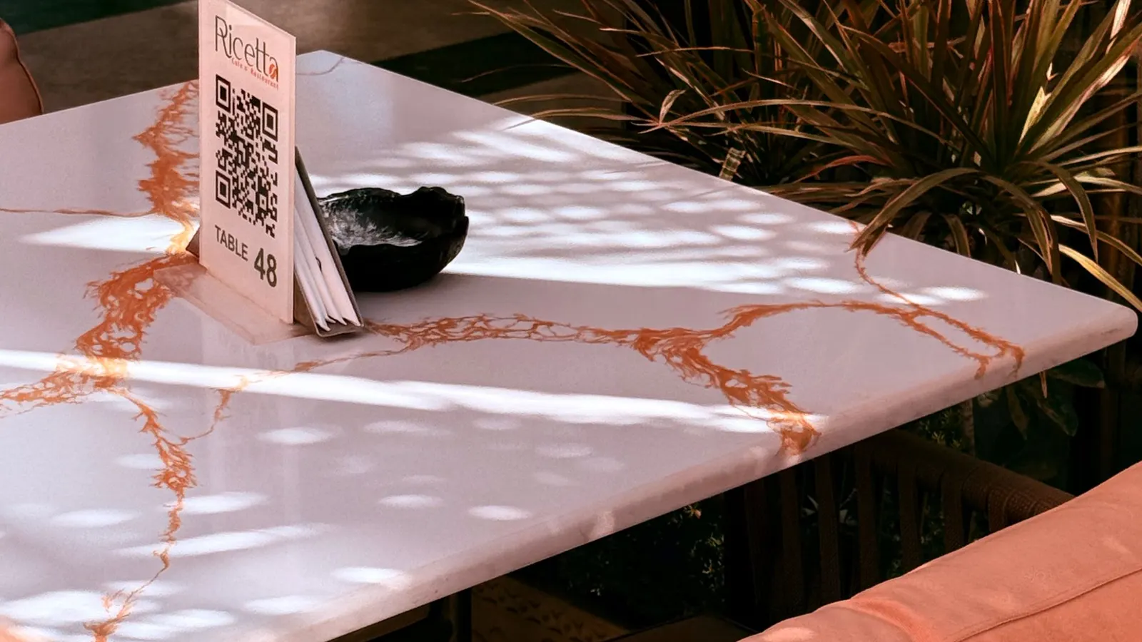
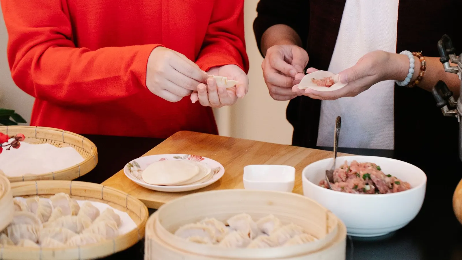
Convenient for the restaurant. Less so for anyone without a charged phone and good eyesight. Photo via Pexels.
There is also a reason restaurants like them beyond saving on printing. A QR code can give a restaurant more information about its customers, as CNBC reported when the codes first took off. None of that is sinister on its own, but it is worth knowing that the menu in your hand may also be collecting information.
The simple fix is to keep a few paper menus behind the host stand. Nobody should need a smartphone to find out what is for dinner.
Can you actually read it?
Most menu problems are the same problems web designers deal with every day: text too small, contrast too low, too much crammed into one space.
The web has a standard for this. The W3C's accessibility guidelines ask for a contrast ratio of at least 4.5 to 1 between regular text and its background. That number was chosen because it helps people with roughly 20/40 vision, which is a lot of people. It is a web rule, not a law for paper, but it is a pretty good gut check for a gray-on-black chalkboard or a menu printed in pale gold on cream.
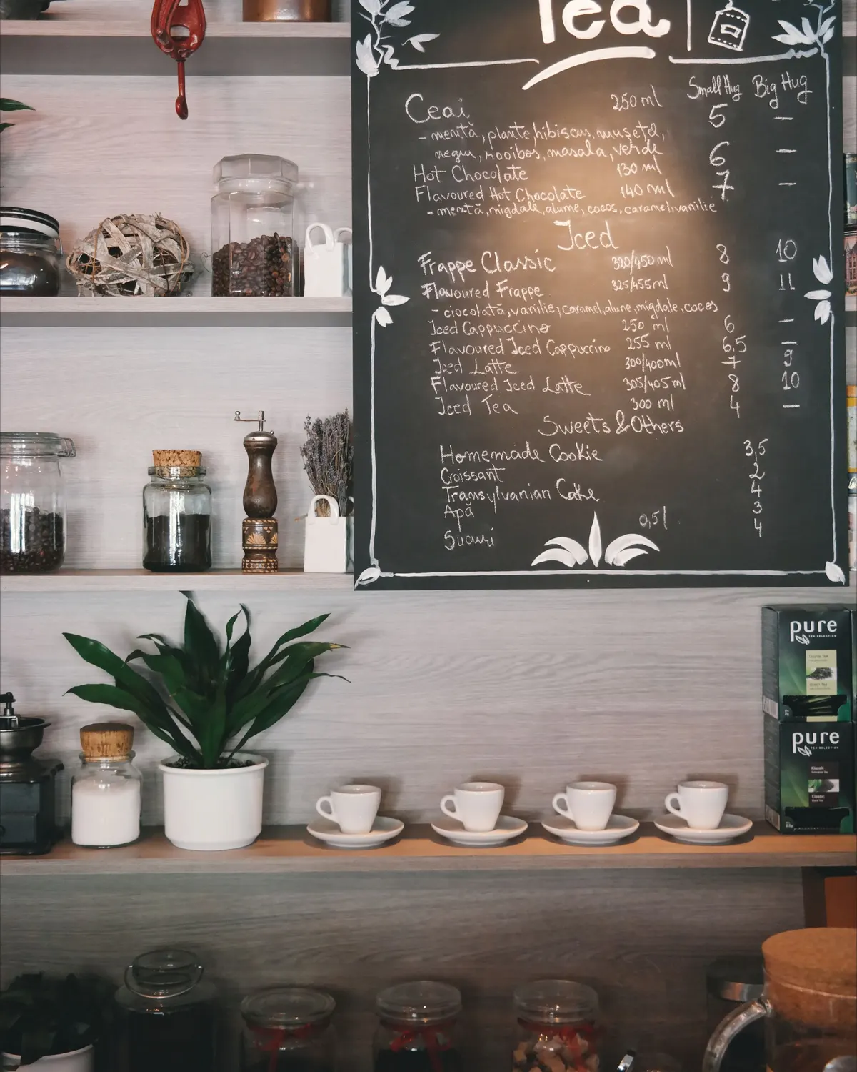
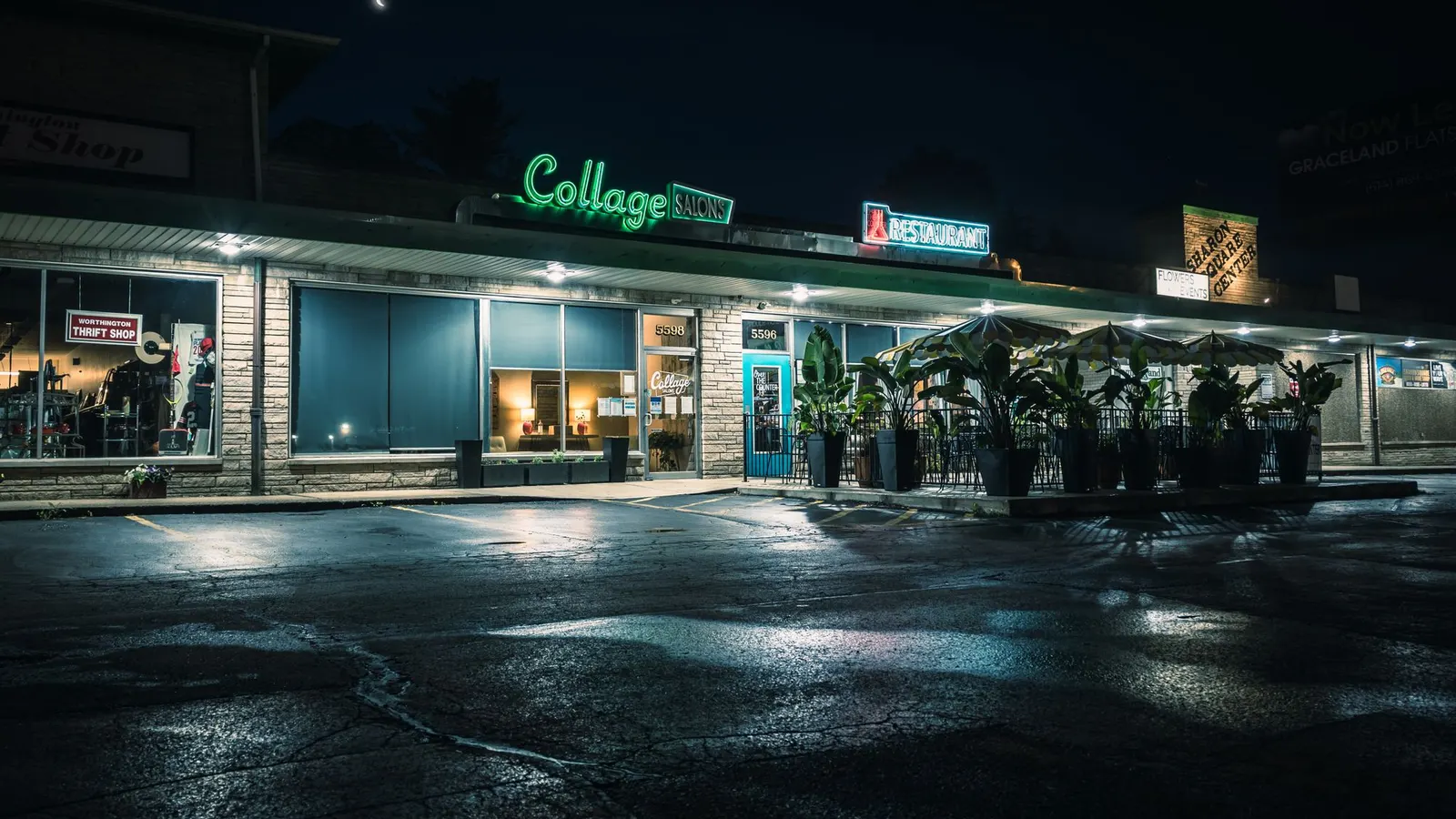
Charming. Now try reading the prices from the back of the line. Photo via Pexels.
About 7 million Americans have some vision impairment, according to the CDC, and that does not count everyone who left their reading glasses in the car. The ADA National Network's guidance for food service is refreshingly plain: menus should be large print, high contrast and non-glare. And the Justice Department's own example of good communication under the ADA is about as simple as it gets. In a restaurant, reading the menu to a customer who is blind lets them decide what to order.
In other words, the most accessible menu feature in the world is a server who says, "Would you like me to read you the specials?"
Where are the prices?
Menus are also designed to influence you, and not all of that is bad. But some of the folklore is shakier than you might think.
For years, restaurant consultants talked about a "sweet spot," a place on the page where diners' eyes supposedly land first. A 2012 eye-tracking study by Sybil Yang found diners mostly read menus sequentially, like a book, and suggested the sweet spot may not exist. It was a small study, but it is a nice reminder that a lot of menu wisdom is just repeated confidently.
Prices are another one. A Cornell study at a single restaurant found diners spent more when prices were shown as plain numbers, like "20," instead of "$20.00" or written out in words, according to the Cornell Hospitality Report. The authors are careful to say it may only apply to that restaurant, at lunch. Fair enough. But from a customer's side, the principle I care about is simpler: show the price. "Market price" on half the menu is not an interface. It is a guessing game, and it makes people nervous about ordering.
Can I eat this?
For a lot of diners, the most important information on a menu is not the description. It is the ingredients.
About 33 million Americans have at least one food allergy, according to Food Allergy Research & Education, which also notes that most fatal food allergy reactions are triggered by food eaten outside the home. The U.S. now recognizes nine major allergens: milk, eggs, fish, crustacean shellfish, tree nuts, peanuts, wheat, soy and, since 2023, sesame. The FDA's model food code, which many states and counties adopt, now recommends telling customers about major allergens in writing.
A menu that marks common allergens, or at least says "ask us about allergens" in a way that feels welcome, does two things. It keeps people safe, and it tells them they are not being a nuisance for asking.
And what language is it in?
In 2019, about 67.8 million people in the United States spoke a language other than English at home, according to the Census Bureau, and roughly one in 12 residents spoke English less than "very well." A short description under each dish, a few photos, or a second language where it makes sense for the neighborhood can do a lot of work.
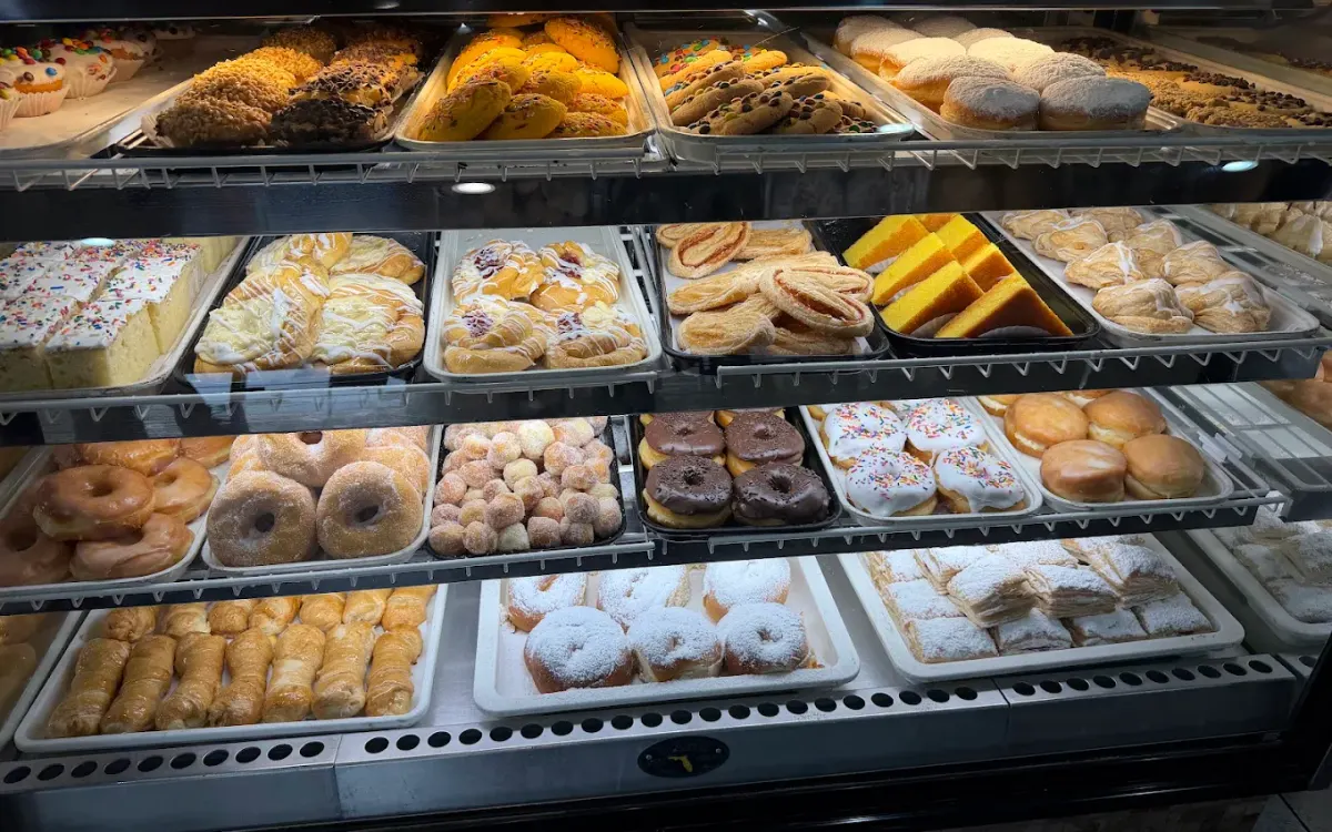
That goes the other way too. A one-line description of what a pupusa is, or a quesito (the Puerto Rican pastry that bakeries like Melao Bakery in Orlando are known for), is not dumbing anything down. It is a door being held open.
A quick checklist
If you run a restaurant, you do not need a designer to fix most of this:
- Keep some paper menus, even if you love your QR code.
- Make the smallest type readable at arm's length, and test it in your actual lighting.
- Show every price.
- Mark the major allergens, or make asking easy.
- Add one plain-English line under dishes people might not know.
- Put the menu on your website as real text, not just a photo of a page. Screen readers and search engines can both read it that way.
If you want to go further on the rest of the room, our accessible storefront checklist and website accessibility checklist cover a lot of the same ground. And if you are just hungry, browse the restaurants in our directory, and let us know which menus get it right.
Sources
- Ipsos, "QR code menus are growing even less popular," July 21, 2025: ipsos.com
- Restaurant Business, on Technomic's 2022 QR menu survey, June 21, 2022: restaurantbusinessonline.com
- CNBC, "QR codes have replaced restaurant menus," August 21, 2021: cnbc.com
- W3C, Understanding Contrast (Minimum): w3.org
- CDC, Fast Facts: Vision Loss: cdc.gov
- ADA National Network, Food Service: Accommodating Diners with Disabilities: adata.org
- ADA.gov, Effective Communication: ada.gov
- San Francisco State University via EurekAlert, on menu "sweet spots," February 1, 2012: eurekalert.org
- Yang, Kimes and Sessarego, Cornell Hospitality Report, May 2009: ecommons.cornell.edu
- Food Allergy Research & Education, Facts and Statistics: foodallergy.org
- U.S. Food and Drug Administration, Food Allergies: fda.gov
- FDA Food Code 2022, summary of changes: fda.gov
- U.S. Census Bureau, "Language Use in the United States: 2019," August 2022: census.gov
- Cover photo via Pexels
About this note. This is an opinion piece, signed by the person who wrote it. Any business it links to is described by its own sourced listing, and a mention here is never an ownership claim.
In this note
Every place mentioned above, with its full listing.
Go deeper


More notes
Know a place we should write about?
Tell us where you felt welcome, or list your own business free with a source you control.